The Unites States Federal Reserve provides a plethora of data free to the public to review, download and analyze. I take a curious look at a few metrics available on the Federal Reserve Economic Data website. The website lists a few different measures of money in the system. M1, M2, and M3 were meant to categorize different types of money but they were so similar, and M3 was discontinued. The difference between M1 and M2 is that M2 is M1 plus certificates of deposit. So, I use M2 data for this endeavor.
M2 is a measure of the money supply that includes cash, checking deposits, and other deposits readily convertible to cash, such as CDs.
When searching for the data I wanted to include, I noticed that much of the data has been discontinued; most of which occurred in January 2021. You can still include that data but it cuts off on the graph. Some of the discontinued data was what I was interested in. There were new metrics that were similar and had the same historical data. It seemed as if previous data calculations were no longer supported and instead replaced by new metrics. I also noticed that the majority of detailed data was discontinued and replaced with only consolidated data. You can see that here, scroll down to see all the discontinued data points.
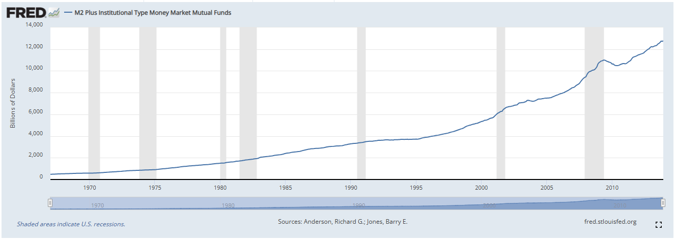
After lots of clicking and determining I could only put 3 data points on a chart at a time, I was intrigued by the data element (M2 Plus Institutional Type Money Market Mutual Funds). The data was only up until 2013, and much of the financial markets in 2022 were focusing on the Federal Reserve’s Reverse Repo Market. It was a widely known fact that Mutual Funds were using the Reverse Repo Facility to park their money for a slightly higher interest rate.
Putting 2 and 2 together, I looked up when the Federal Reserve created the Reverse Repo Facility. Turns out, it was created in 2013. Just looking at that line, it seems like it was climbing fairly quickly.

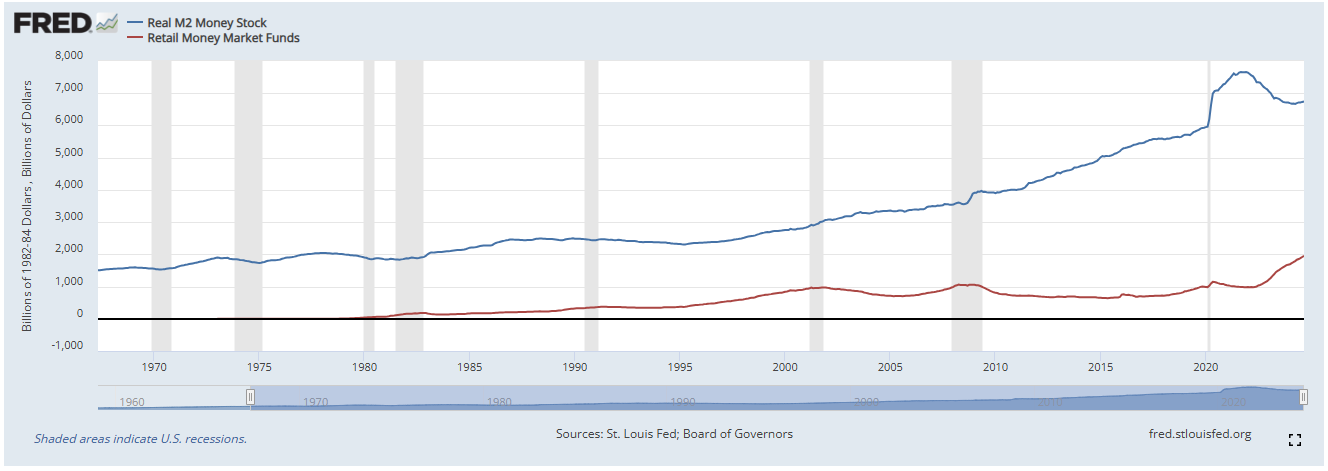
I went looking for its replacement data, unfortunately they are no longer combined. They are separate but with slightly different titles. In the chart below I found the two components, Real M2 Money Stock and Retail Money Market Funds.
The Real M2 Money Stock is simply the M2 money supply adjusted for CPI (the annualized inflation metric used by the financial markets).
The Retail Money Market Funds definition of this data element from the FRED website is:
“The retail money funds component of M2 is constructed from weekly data collected by the Investment Company Institute (ICI), a trade association for the investment company industry. The retail money funds component of M2 excludes IRA and Keogh balances held at MMMFs, which are reported by ICI on a quarterly basis.“
While the name changed from Institutional to Retail, all retail investment products are custodied by institutions and hence included in this data. There is no categorization of retail dollar value vs institutional dollar value being invested.

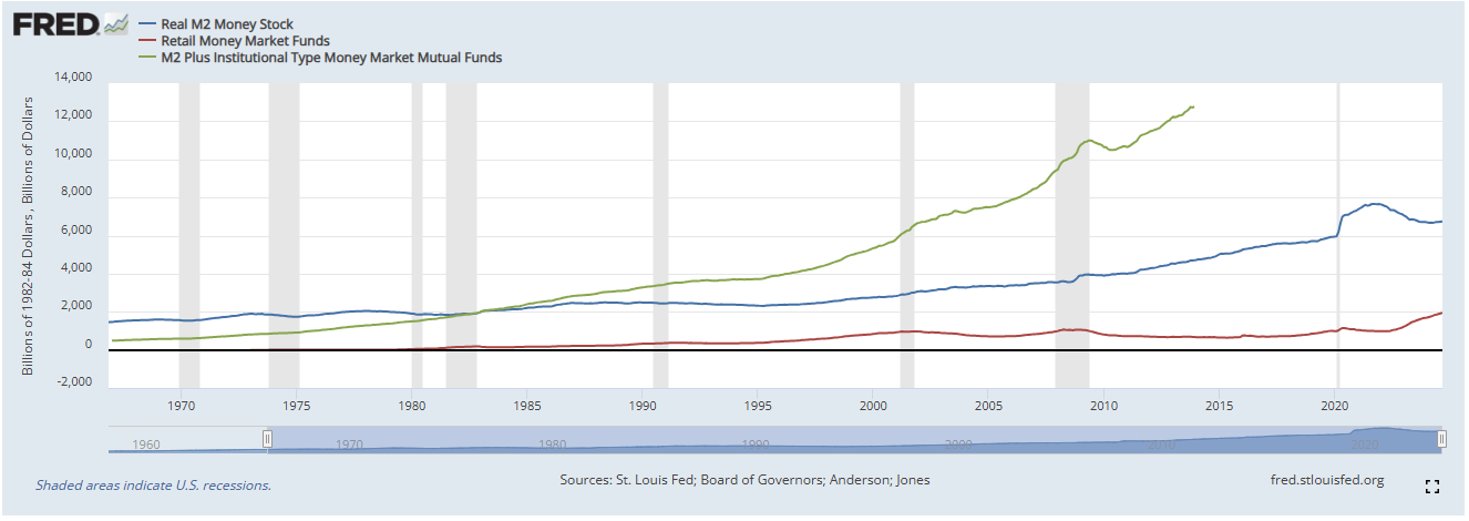
Looking at the chart above, what we see are the two components that made up the original one. This chart didn’t seem to be going as steeply as its counterpart. So I added the old metric to the chart:

When all three are on the same chart, you can see where this old metric would be on the chart today. By splitting the data, you can obfuscate the dramatic rise in money supply because the green line represents the red and blue ones combined.
The only way to protect yourself from an ever-expanding US dollar money base, is to convert your currency into assets that cannot be created easily.